Design With Contrast, Not Just Footcandles
The Hidden Psychology of Brightness
When evaluating a space, it’s easy to assume that if it feels dark, the solution is simply to add more light. But experienced lighting designers know that our perception of brightness isn’t determined by footcandles alone. Instead, our eyes are constantly adapting to the brightest surfaces in our field of view. This means two spaces with identical illuminance can feel dramatically different depending on the contrast between them. Understanding this distinction allows architects and designers to create environments that are not only visually comfortable, but also more energy-efficient and engaging.
We Perceive Light Relatively, Not Absolutely
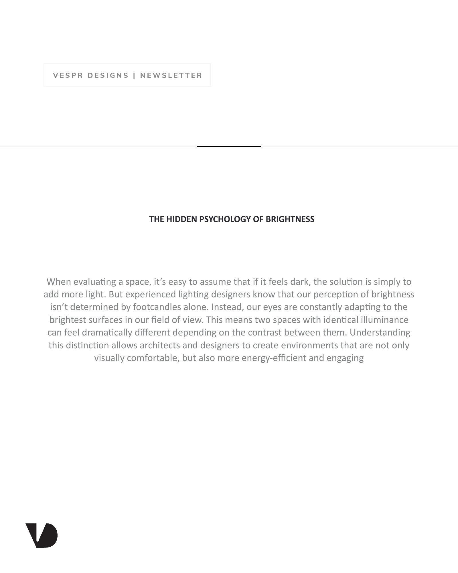
Illuminance measures how much light reaches a surface, but luminance, the light reflected toward our eyes, is what determines how bright a space actually feels. Our visual system continuously adapts to the brightest areas around us. As a result, spaces that meet recommended lighting levels can still appear underlit if they are adjacent to significantly brighter environments.
Imagine a gallery illuminated to a comfortable level. On its own, it feels bright and inviting. Introduce a large sunlit atrium just outside the entrance, and that same gallery can suddenly feel dim, even though the lighting hasn’t changed. The difference lies in visual adaptation, not the light meter.
Better Balance Often Beats More Light
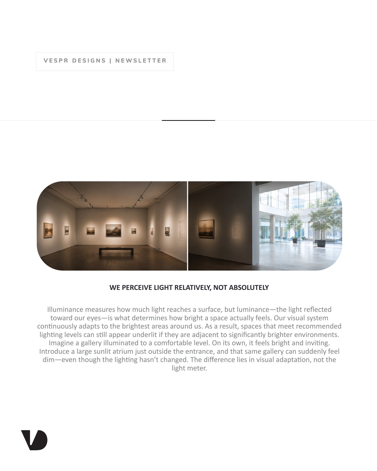
When a space feels too dark, increasing fixture output is often the first response. A better question is: What is creating the contrast? Rather than adding more light, consider:
Reducing excessive brightness from adjacent spaces and surfaces.
Creating smoother transitions between bright and dim areas.
Illuminating walls and other vertical surfaces to improve perceived brightness.
Limiting overly bright focal points that dominate the visual field.
In many cases, balancing luminance creates a brighter-feeling environment while using the same, or even less, light.
Contrast Is a Design Tool, Not a Problem
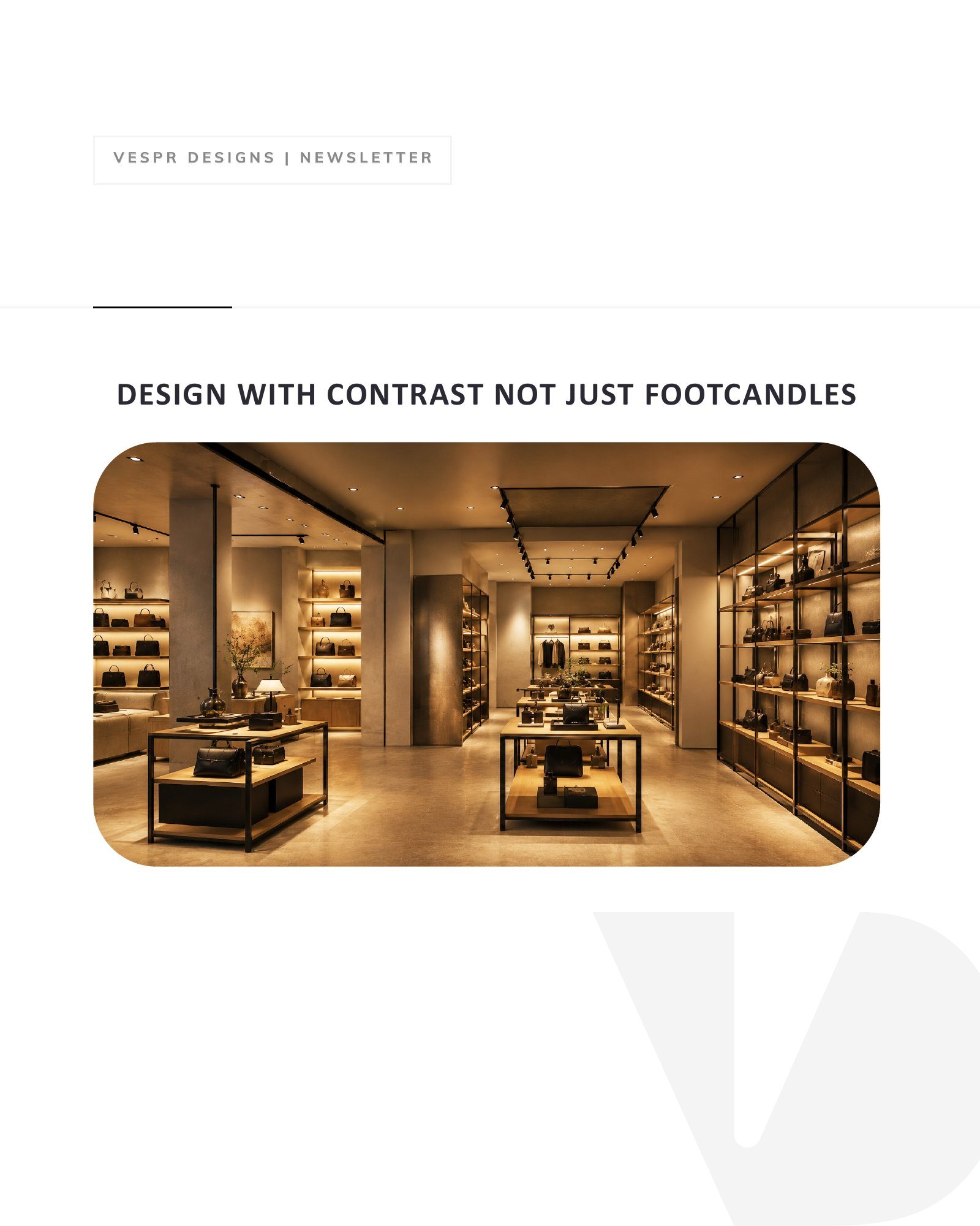
Contrast is essential to great architectural lighting. It directs attention, establishes hierarchy, and adds depth to a space. The goal is not to eliminate contrast, but to control it intentionally. Thoughtfully designed contrast can:
Highlight artwork and architectural features.
Guide circulation and wayfinding.
Create intimacy in hospitality spaces.
Draw attention to retail merchandise and key destinations.
Successful lighting design balances emphasis with visual comfort, ensuring that important elements stand out without overwhelming the overall experience.
Designing for Perception Supports Sustainability
Designing for perception often leads to better-performing environments. By managing contrast instead of simply increasing illumination, projects can improve comfort while reducing energy consumption. Balanced luminance can:
Make spaces feel brighter without increasing light levels.
Reduce glare and visual fatigue.
Lower installed lighting power and operating costs.
Maintain recommended illuminance while enhancing the user experience.
It’s a reminder that effective lighting design is about quality, not quantity.
Light meters measure illuminance, but people experience luminance. By understanding how the human eye adapts to contrast, designers can create spaces that feel brighter, more comfortable, and more memorable without simply adding more fixtures. The best lighting designs don’t maximize illumination, they optimize perception.
See the original newsletter (7 pages)